CSS Fonts
Written By: Avinash Malhotra
Last Updated:
CSS Font Properties
CSS can change Font Properties of HTML text elements, like font size, line height, font family, font weight, font style, font stretch, font variant, Font Family etc. Using fonts properties, we can change look of any html text element. In this article, we will learn all CSS Font Properties one by one.
Font Properties List
Font Size
Font size property in css can change the font size of fonts. By default, all html elements are having their own font size set by useragent (browser).
Default Font size of root element html is 16px, p tag is 1em and h1 tag is 2em.
The popular units for CSS fonts size are em and px. The Top 5 font-size font-size units are.
Font Size values in CSS
- Pixels (px) → As per height of screen pixels
- Em(em) → Relative to nearest parent.
- percentage (%) → Relative to parent element.
- rem (rem) → relative to root parent ( HTML Tag)
Others units are pc (picas), cm (centimeters), mm (millimeters), pt (points) and in (inches) usually preferred for print css.
"em", "rem", and "%" are relative units, whereas px and pt are fixed.
em is relative to parent element, but rem is relative to html element only.
If Font Size of body or parent element is 100% or 16px the font size of p tag will be
16px = 1em =100% = 1 rem.px Vs em vs rem
Font size 16px
Font size 1 em
Font size 100%
Font size 1rem
<div style="font-size:16px">
    <p style="font-size:16px">Font size 16px </p>
    <p style="font-size:1em">Font size 1em </p>
    <p style="font-size:100%">Font size 100% </p>
    <p style="font-size:1rem">Font size 1rem </p>
</div>
If font-size of parent element is more than 100% or 16px, em and % will change, but px and rem remains same.
Absolute Font Size
Font Size can have absolute size values. There are total 8 absolute size values in css between small to large.
xx-small
x-small
small
medium
large
x-large
xx-large
xxx-large
    <p style="font-size:xx-small">xx-small</p>
    <p style="font-size:x-small">x-small</p>
    <p style="font-size:small">small</p>
    <p style="font-size:medium">medium</p>
    <p style="font-size:large">large</p>
    <p style="font-size:x-large">x-large</p>
    <p style="font-size:xx-large">xx-large</p>
    <p style="font-size:xxx-large">xxx-large</p>
Relative Font Size
Font Size can have relative size values. There are 2 relative size values in css, smaller and larger.
smaller
larger
    <p style="font-size:smaller">smaller</p>
    <p style="font-size:larger">larger</p>
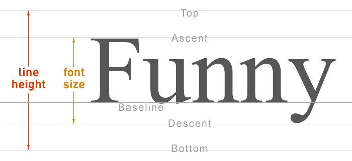
Line-Height
Line-height property defines the actual height of a line. The default line height of all text elements is normal. Other line height units are px and number which is ratio of line height and font size.
Line Height Values
- normal
- number, ratio of font-size
- px
- %
- em/rem
Line-height in px is fixed, whereas in numbers is relative to font-size. 1 means 100% of font-size, 2 means 200% of font-size.
For n number of lines, the line-height is equal to total height divided by no of lines.
Line Height Normal
Line Height 1
Line Height 2
Line Height 16px
Line Height 20px
Line Height 24px
Line Height 30px
    <div>
        <p style="line-height:normal">Line Height normal </p>
        <p style="line-height:1">Line Height 1 </p>
        <p style="line-height:2">Line Height 2 </p>
        <p style="line-height:16px">Line Height 16px </p>
        <p style="line-height:20px">Line Height 20px </p>
        <p style="line-height:24px">Line Height 24px </p>
        <p style="line-height:30px">Line Height 30px </p>
    </div>
Always prefer line height in numbers as numbers are relative. Line height is pixel is fixed.
Font Weight
In CSS, Font weight is used to give Bold or Bolder appearance to font. Various value of font-weight are
Font Weight value in number
- 100 or thin
- 200 or extralight
- 300 or light
- 400 or regular
- 500 or medium
- 600 or semibold
- 700 or bold
- 800 or extrabold
- 900 or black
Number of Font Weights for any fonts can very. For example, serif supports 2, sans-serif supports 3, 'helvetica neue' supports 5.
Change Font Weight
Font Weight 100
Font Style
In CSS, Font style is used to gives italics appearance. Various value of font-style are
- Italic
- Normal
Font style Normal
Font style Italic
<p style="font-style:normal"> Font style Normal </p>

<p style="font-style:italic"> Font style Italic </p>
Font Variant
CSS Font variant is used to set variant of font we are using. Font variant small caps set all text in smaller size and all capitals. Various values of font variant are
- Normal
- Small-caps
Font variant normal.
Font variant small caps.
<p style="font-variant:normal"> Font style normal </p>

<p style="font-variant:small-caps"> Font style small caps. </p>
Font Stretch
CSS Font stretch is used to stretch the font if available. Like we can set condensed, expanded, extra condensed or extra condensed values of font stretch.
Various values for font stretch are- normal
- condensed
- semi-condensed
- ultra-condensed
- extra-condensed
- expanded
- semi-expanded
- ultra-expanded
- extra-expanded
Font stretch normal.
Font stretch condensed.
Font stretch semi condensed.
Font stretch extra condensed.
Font stretch ultra condensed.
Font stretch expanded.
Font stretch semi expanded.
Font stretch extra expanded.
Font stretch ultra expanded.
<p style="font-stretch:normal"> Font stretch normal </p>


<p style="font-stretch:condensed"> Font stretch condensed </p>

<p style="font-stretch:semi-condensed"> Font stretch semi condensed </p>

<p style="font-stretch:extra-condensed"> Font stretch extra condensed </p>

<p style="font-stretch:ultra-condensed"> Font stretch ultra condensed </p>


<p style="font-stretch:expanded"> Font stretch expanded </p>

<p style="font-stretch:semi-expanded"> Font stretch semi expanded </p>

<p style="font-stretch:ultra-expanded"> Font stretch extra expanded </p>

<p style="font-stretch:extra-expanded"> Font stretch ultra expanded </p>
Font Family
In CSS, Font family specify the Font Typeface or Font Family we are using. These fonts are already embedded in our operating system. But in CSS3, we can embedded external fonts too.
Web Safe Fonts
Web Safe fonts are fonts mainly used for websites. These fonts are available across all Operating Systems.
Sans Serif
Sans Serif and family fonts are best for screens. They can be used on websites, softwares, mobile apps, etc.
- Sans-Serif
- Arial
- Helvetica
- Helvetica Neue
- Calibri
- Gill Sans
- Open Sans
- Impact
- Tahoma
- Trebuchet MS
- Verdana
Serif
Serif and family fonts are best for print. They are best suitable for css print media and print media.
- Serif
- Times new roman
- Times
- Georgia
Monospace
Monospace Fonts are fonts used in type writers. By-default, pre tag use monospace font. tt also used the same family, but it was removed in HTML5.
- Monospace
- Courier
- Lucida
- Monaco
Cursive Fonts
These fonts are based on cursive font family.
- Cursive
- Brush Script MT
- Comic Sans MS
- Bradley Hand
Other Font Families
- Fantasy
- Lumanari
- Algerian
Alternative Font
We can also use two or more font-family for alternative fonts. This technique is really helpful and mostly recommended. System will pick first font. If its not available, the next alternative will be picked.
<style>
    body{ font-family: 'helvetica neue', helvetica, sans-serif}
</style>
Best recommended font for web
System-ui is the best recommended font for most of the websites. It is supported by all platforms and browsers.
System UI Font Family
<style>
body{
font-family: system-ui, -apple-system, BlinkMacSystemFont, 'Segoe UI', Roboto, Oxygen, Ubuntu, Cantarell, 'Open Sans', 'Helvetica Neue', sans-serif;
}
</style>
Font Stack
Font Stack is grouping matching fonts together to avoid cross operating system issues. When one font is missing in a particular OS, the substitution font will work. This is called font Stack. Like sans-serif can be used with arial and helvetica and times can used with times new roman.
Font family system-ui, sans-serif.
Font family Arial, Helvetica and sans serif
Font family Times, times new roman and serif.
<p style="font-family: system-ui, sans-serif;"> Font family system-ui, sans-serif. </p>

<p style="font-family: helvetica, arial, sans-serif"> Font family  Helvetica,  Arial and sans serif. </p>

<p style="font-family: times, 'times new roman', serif"> Font family Times, times new roman and serif. </p>
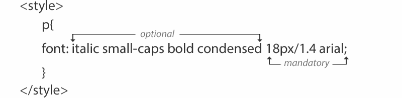
Font
CSS Font Property is used to group all font properties in one single property. Properties like font size and font family are compulsory to add, rest all are optional. Line height must come after font-size separated by slash (/).
Font with size 16px, line height normal and arial font.
Font with size 14px, line height 18px and arial font.
Font with size 14px, line height 1.4, bold and Cursive font.
Font with size 18px, line height 1.4, bold, italic, small caps, condensed and arial font.
<style>
    .p1{ font:16px arial; }
    .p2{ font:14px/16px arial; }
    .p3{ font:bold 18px/1.4 cursive; }
    .p4{ font:small-caps condensed bold italic 18px/1.4 sans-serif; }
</style>

<p class="p1"> Font with size 16px, line height 18px and arial font.</p>

<p class="p2"> Font with size 14px, line height 18px and arial font.</p>

<p class="p3"> Font with size 18px, line height 1.4, bold  and Cursive font.</p>

<p class="4"> Font with size 18px, line height 1.4, bold, italic, small caps, condensed and arial font.</p>