Box Shadow
Written By: Avinash Malhotra
Updated on
CSS3 Box Shadow
CSS3 Box Shadow is a new property to add shadow effects to any html Element. You can choose your own color, offset, blur, spread, offset and repetition. Unlike border, it not a part of CSS Box Model, thus doesn't effect the layout even if it is bigger in size. Also we can add multiple shadows with different colors and offsets.
Box Shadow Generator
0px 0px 0px 0px #000
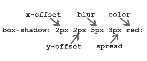
Box Shadow Example
Box Shadow can be both outside ( default ) or inside. In the next example, we will cover both examples one by one.
Outer Box Shadow
Default box shadow is outer. x-offset and y-offset are compulsory properties, rest all are optional. Default blue and spread is 0px and default shadow color is font-color. However we can also change blur, spread and shadow color.
See examples
box-shadow: 0px 0px 5px 2px red;
shadow is equal from all four sides as x-offset and y-offset are zero. Blur is 5px, spread is 2px, and color is red.
box-shadow: -2px -2px 10px 0px blue;
shadow is 2px left and 2px top as both values are negative. Blur is 10px, spread is 0px(no solid color of shadow), and color is blue.
box-shadow: 2px 2px 10px 0px blue;
shadow is 2px from left and 2px from top as both values are positive. Blur is 10px, spread is 0px(no solid color of shadow), and color is blue.
box-shadow: 5px 5px 0px 5px aqua;
shadow is 5px from left and 5px from top as both values are positive. Blur is 0px, spread is 5px(only solid color of shadow), and color is aqua.
Inner Box Shadow
To use inner box shadow, use inset. Inset is only required if shadow is inside. By-default shadow is outside. See examples
box-shadow: 2px 2px 5px 1px red inset;
shadow is 2px from left and 2px from top as both values are positive. Blur is 5px, spread is 1px, color is aqua, and inset is for inside shadow.
box-shadow: 0px 0px 20px 1px white inset;
shadow is 0px from left and 0px from top as both values are positive. Blur is 20px, spread is 1px, color is white, and inset is for inside shadow.
box-shadow: 0px 0px 80px 1px #bbb inset;
shadow is 0px from left and 0px from top as both values are positive. Blur is 80px, spread is 1px, color is #bbb, and inset is for inside shadow.
Multiple Box Shadows
To use Multiple box shadows, use comma (,). Comma works as a separator for multiple box shadows. We can use n numbers of box shadows by using comma separator. See examples
box-shadow: -2px -2px 5px 1px #f00, -4px -4px 5px 0px #00f;
, is used a s separator in value, rest all values remains same.
box-shadow: -2px -2px 5px 1px #000, 2px 2px 5px 0px #f00;
black shadow is on left top, red shadow is on right bottom
box-shadow: -2px -2px 5px 1px #f00, 2px 2px 5px 0px #f0f, 0px 0px 50px 0px #000 inset;
three shadows, two offset, one inset
Box Shadow vendor Prefixes
How to use Box Shadow using browser prefixes.
border-shadow:0px 0px 10px red ;            // all latest browsers

-webkit-border-shadow:0px 0px 10px red;     // for Chrome, Edge, Firefox, Safari

-moz-border-shadow:0px 0px 10px red;        // for Mozilla based browser

-ms-border-shadow:0px 0px 10px red;         // for IE 9 and above

-o-border-shadow:0px 0px 10px red;          // Opera browsers
Buttons Design using Box Shadow
Chrome, Safari, Firefox 4, Opera, and IE9 support Box Shadow without any vendor prefix (exp. box-shadow). But we need to add another property like -moz-box-shadow for Firefox 3.6 and earlier.