HTML5 Form
Written By: Avinash Malhotra
Updated on:
Html5 Form with Validation
HTML5 Form includes New Form Elements & New Form Attributes for Form Validation and better usability on touch devices.
Using HTML5, we can create a form with built in validation (i.e. no javascript required). Earlier, we were using JAVASCRIPT to control form validation. These form controls are meant for both Desktop, tablets and smart phones.
These Form Controls are also touch friendly.
HTML5 Form Features
| New Attributes | autofocus, required, placeholder, autocomplete, pattern, minlength, readonly, list. |
| New Input Types | number, email, tel, search, url, range, date, month, week, time, color, range |
| New Elements | meter, progress, datalist. |
HTML5 Form Attributes
HTML5 Form includes more attributes for functionality in HTML5 Form. Exp autofocus, placeholder, required, autocomplete, pattern, list etc.
Here are all HTML5 form elements with examples and use.
novalidate
novalidate attribute is used in form tag to disable HTML5 based Form validation. After using novalidate in form tag, required and type based validation will not work. We need to use javascript form validation after using novalidate attribute
Form without novalidate
<form>
    <label>Name: <input type="text" required></label>
    <input type="submit">
</form>
Form with novalidate
<form novalidate>
    <label>Name: <input type="text" required></label>
    <input type="submit">
</form>
Autofocus
autofocus attribute focus on a single form control on page load. autofocus can be used only once in a single webpage. Make sure autofocus element is visible on viewport on page load.
<label>Search: <input type="search" autofocus></label>
Placeholder
placeholder attribute shows some hint in input control. Placeholder value will disappear on focus or keypress. Supported controls for placeholder are input controls and textarea. The default color of placeholder is lightgray, i.e (#999).
Placeholder in input
<label>Name: <input type="text" placeholder="Enter Name"></label>
Placeholder in textarea
<label>Query: <textarea placeholder="Query"><textarea></label>
Autocomplete
autocomplete attribute can show or hide browser cache. Default value of autocomplete is on. But autocomplete off can disable browser cache.
We can use autocomplete on inputs, textarea and form tag.
autocomplete values
- on ( Default)
- off
<label>Name: <input type="text" placeholder="Enter Name"></label>

<label>Name: <input type="text" placeholder="Enter Name" autocomplete="off"></label>
Required
required attribute is a boolean attribute used to add validation in form controls like inputs, textarea, radio controls, checkbox and select dropdown. With required, a blank form control cannot submit data.
Required in input
<form>
<label>Name: <input type="text" placeholder="Enter Name" required><label>
</form>
required in checkbox
<form>
<label>Terms <input type="checkbox" required></label>
</form>
required in radio buttons
<form>
<label><input type="radio" name="gender" required> Male</label>
<label><input type="radio" name="gender" required> Female</label>
</form>
required in select dropdown
<form>
<select aria-label="City" required>
<option value="" selected disabled>--Choose City--</option>
<option>New Delhi</option>
<option>Chennai</option>
<option>Mumbai</option>
<option>Kolkata</option>
</select>
</form>
Pattern
Create JavaScript regular expression for input controls and textarea. Regex can be used to validate pincode, debit/credit card no, cvv no, atm pin etc.
<label>Pincode: <input type="text" placeholder="Enter Pincode" required pattern="^[0-9]{6}$" title="Enter Valid Pin Code"></label>
Minlength
Will submit a form only when this field is filled with minimum n characters.
<label><input type="text" placeholder="Enter Name" required minlength="3"></label>
Readonly
A control with readonly attribute is on readable by user, but unlike disable, it can send data to web server. disable cannot send data to server.
<label>Country: <input type="text" value="India" readonly></label>
list
list attribute is used to link a datalist tag with input control. The value of datalist is shown as hint on keyup.
<label><input aria-label="City Name" type="text" placeholder="Enter City Name" list="cities" required></label>

<datalist id="cities">
    <option>New Delhi</option>
    <option>Chennai</option>
    <option>Kolkata</option>
    <option>Mumbai</option>
</datalist>
HTML5 Form Input Types
HTML5 also includes some new input types with validation. These types works on both Desktops based browsers and Mobile based browsers.
input type number
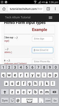
input type number is used to insert only numbers from user. For example age, number etc. min and max attributes are also used with input type number. step can increase step value, default step value is 1.
input type number can change keyboard layout on smartphones like Android and Iphone.
Input Type Number
Input Type Number with min and max
Input Type Number with step
<form>
    <input type="number" placeholder="Enter any number" required>

    <input type="number" placeholder="Enter Age" required min="1" max="90">

    <input type="number" placeholder="Enter Even No" min="2" max="100" step="2" required>

    <input type="number" placeholder="Choose a no" min="1" max="5" step="0.1" required>
</form>
Keyboard Layout on Android and IOS

( Samsung Galaxy Note 3)

( Iphone 6s)
Input type email
input type email is used get email id from user. Default pattern for email id is n@n where n is any string,
i.e. a string character, followed by @, and again one more string.
<form>
<label><input type="email" placeholder="Enter Email" required></label>
</form>
Keyboard Layout on Android and IOS
( Samsung Galaxy Note 3)

( Iphone 6s)
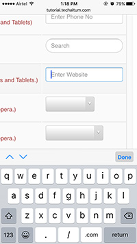
Input type tel
input type tel is used get insert a telephone no ( Landline, mobile or virtual) from user. There is no build in pattern for phone numbers. We can use country specific patterns for validations.
<input type="tel" placeholder="Enter Phone No" required>
Keyboard Layout on Android and IOS
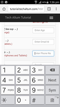
( Samsung Galaxy Note 3)

( Iphone 6s)
Input type search
input type search is used to for search box only. It looks similar to input type text but with a optional cross button on right in some browsers.
<input type="search" placeholder="Search Here" required>
Keyboard Layout on Android and IOS

( Samsung Galaxy Note 3)
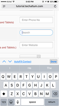
( Iphone 6s)
Input type url
input type url is used to input a website url or a link. A URL must starts with protocol ( HTTP or HTTPS). For example, a website, linkedin profile link, github profile link etc.
<input type="url" placeholder="Enter Website" required>
Keyboard Layout on Android and IOS
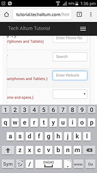
( Samsung Galaxy Note 3)
( Iphone 6s)
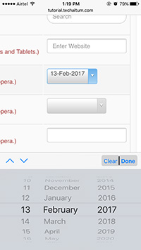
Input type date
input type date is used choose a valid date from user. Chrome, Edge, opera, Firefox, Safari, Android and IOS browsers also shows datepicker calender in input type date, but IE browser doesn't support datepicker calender yet.
Browsers supporting input type date
- Chrome
- Chromium
- Edge (12 and above)
- Edge Chromium
- Firefox
- Safari ( 14 and above)
Browsers not supporting input type date
- Safari ( 13 and below)
- IE ( all versions)
<input type="date" required>
Input Type date with min and max
<input type="date" min="2024-01-01" max="2025-12-31" required>
Keyboard Layout on Android and IOS

( Samsung Galaxy Note 3)
( Iphone 6s)
Input type month
input type month is used choose a valid month from user. Chrome, Edge, opera, android and ios also shows datepicker.
<input type="month" required>
input type month with min and max
<input type="month" min="2024-01" max="2025-12" required>
Keyboard Layout on Android and IOS

( Samsung Galaxy Note 3)

( Iphone 6s)
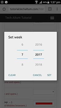
Input type week
input type week is used choose a valid week number from user. Chrome, Edge, opera, android and ios also shows datepicker with week no.
<input type="week" required>
input type week with min and max
<input type="week" min="2024-W01" max="2025-W52" required>
Keyboard Layout on Android and IOS
( Samsung Galaxy Note 3)
( Iphone 6s)
Input type time
input type time is used choose a valid time from user in 12 hours format.
<input type="time" required>
input type time with min and max
<input type="time" min="08:00" max="18:00" required>
input type time with step
<input type="time" step="900" required>
Keyboard Layout on Android and IOS

( Samsung Galaxy Note 3)
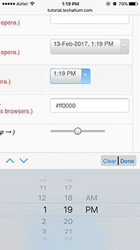
( Iphone 6s)
Input type datetime-local
input type datetime-local is used choose a valid date and time from user in 12 hours format.
<input type="datetime-local" required>
input type datetime-local with min and max
<input type="datetime-local" min="2024-01-01T10:00" max="2025-12-31T23:59" required>
Keyboard Layout on Android and IOS
( Samsung Galaxy Note 3)
( Iphone 6s)
Input type color
input type color is used choose a color from user. Chrome, android and opera shows a color picker, but other browsers doesn't.
<input type="color" >
Keyboard Layout on Android and IOS
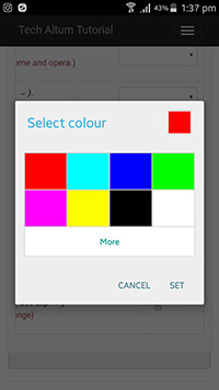
( Samsung Galaxy Note 3)

( Iphone 6s)
Input type range
input type range is used choose a range of numbers. min and max are used to specify range value.
<input type="range" min="0" max="100" >
input type range with step
<input type="range" min="0" max="100" step="10" >
input type range with hash marks
    <input type="range" min="0" max="100" step="25" list="hash">
    <datalist id="hash">
        <option value="0"></option>
        <option value="25"></option>
        <option value="50"></option>
        <option value="75"></option>
        <option value="100"></option>
    </datalist>
HTML5 Form Elements
HTML5 also includes some new form Elements like meter, progress and datalist.
Meter Tag
HTML5 Meter is used to show gauge. This meter will be green if value is greater than high, yellow if value is in between high and low, and red if value is less than low.
<meter min="0" max="100" low="40" high="80" optimum="100" value="90"></meter>
<meter min="0" max="100" low="40" high="80" optimum="100" value="60"></meter>
<meter min="0" max="100" low="40" high="80" optimum="100" value="30"></meter>
Progress
Show progress of task completion.
<progress max="100"></progress>
<progress value="50" max="100"></progress>
Datalist
HTML5 Datalist is used to add datalist with input type text.
<input type="text" list="city">

<datalist id="city">
<option>New Delhi</option>
<option>Chennai</option>
<option>Kolkata</option>
<option>Chennai</option>
</datalist>