HTML Meta Tag
Written By: Avinash Malhotra
Updated on
Meta Tag
HTML meta tags or metadata are used to add metadata to a webpage. Usually meta tags are defined in <head> tag as these data are for search engines. Meta Tags were earlier known as meta tags, but in HTML5, the new name is metadata.
Meta tags are used in head to add meta charset, meta description, meta viewport, meta open graph etc.
Meta Tag example
<meta>
Meta tag attributes
- name
- charset
- http-equiv
- itemprop
Meta Charset
meta charset is used to specify the character encoding of webpage. It is compulsory to declare meta charset in a webpage.
For Windows OS, the default value for meta charset is windows-1252.
UTF-8 or Unicode Transformation Format is the the most popular charset. UTF-8 can render almost all characters like alphabets, numbers, greek, devanagari, spanish, french, chinese etc. UTF-8 is also the default charset of Chrome Browser.
Meta charset
<meta charset="utf-8">
Meta charset is compulsory for all webpages in a website.
Meta Description
Meta description is the metadata used to declare description for search engines. Almost all search engines used meta description to know description of a webpage.
It is recommended to used meta description in head for search engines. The recommended character length for meta description is 160 characters.
Meta Description example
<meta name="description" content="type your description here">
Meta description on google search engine

Meta Viewport
Meta Viewport is used in head. Viewport means the visible part of screen on any device.
Meta viewport is used in Responsive Web Design to control the width, scaling and user scalability.
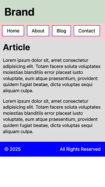
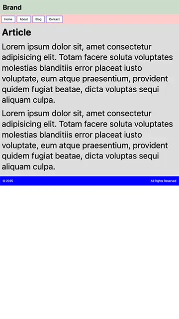
Without viewport, browser display a webpage as per the actual screen size. But meta viewport adjust the screen fonts as per the device pixel ratio. This means, we can see same desktop font on mobile device without zooming.
With and without meta viewport
With Viewport

With Viewport

Meta Viewport Example
Viewport default
<meta name="viewport" content="width=device-width, initial-scale=1.0"> Viewport for the sites with no scaling
<meta name="viewport" content="width=device-width, initial-scale=1, maximum-scale=1, user-scalable=no">
Viewport for landscape Iphones with notch or pills
<meta name="viewport" content="width=device-width, initial-scale=1, viewport-fit=cover">
Viewport Width Vs Device Width
| Device | Viewport Size | Actual Size | Device Pixel Ratio |
| Iphone 14,15 Pro Max | 432*932 | 1290*2796 | 3 |
| Iphone 15, 15 & 14 Pro | 393*852 | 1179*2556 | 3 |
| Iphone 12 & 13 | 390*844 | 1170*2532 | 3 |
| Iphone X, XS | 375*812 | 1125*2436 | 3 |
| Iphone 8 Plus | 414*736 | 1080*1920 | 3 |
| Iphone 8, SE | 375*667 | 750*1334 | 2 |
| Samsung Galaxy S8, S9 | 360*740 | 1440*2960 | 4 |
| Ipad (9.7 inch), Ipad Mini | 768*1024 | 1536*2048 | 2 |
| Ipad Pro 11 | 834*1194 | 1668*2388 | 2 |
| Macbook Air (13 inch) | 1440*900 | 2560*1600 | 2 |
| Macbook Pro (14 inch) | 1512*982 | 3024*1964 | 2 |
| Macbook Pro (16 inch) | 1728*1117 | 3456*2234 | 2 |