Introduction
Expander is a layout in which we can add control and expand it when we need. When have less space in our application then we can use expander layout. We can assign the expand direction either down, up, left or right. At the time of expander creation we can assign IsExpanded property true or false. It has the same drawback as GroupBox that it can contain only one control.
For Example
	<Window x:Class="WpfApplication2.MainWindow"
        xmlns="http://schemas.microsoft.com/winfx/2006/xaml/presentation"
        xmlns:x="http://schemas.microsoft.com/winfx/2006/xaml"
        Title="Tech Altum" Height="500" Width="700">
    <Expander IsExpanded="False" ExpandDirection="Down" Header="Expand To See the Content">
        <DockPanel>
        <Button DockPanel.Dock="Left" >Left Button</Button>
        <Button DockPanel.Dock="Bottom">Bottom Button</Button>
        <Button DockPanel.Dock="Right">Right Button</Button>
        <Button DockPanel.Dock="Top">Top Button</Button>
        <Button>Extra Space</Button>
    </DockPanel>
    </Expander>
</Window>
The output of this example is as follows:-
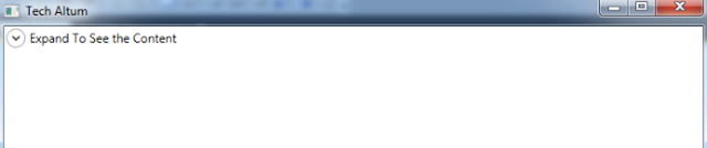 Figure 1
When you click on expander it will show the content.
Email Address
For any query you can send mail at info@techaltum.com Thanks